
URBAN DNA Santa Eulalia: Designing the Project Brand
Edited on
02 October 2018This spontaneous (unplanned) movement and its potential for generating prosperity, coexistence and creativity, demands a logistical support that facilitates interaction between the different actors: neighbours, businesses and visitors, whilst simultaneously displaying a model of intergenerational coexistence and a different model of conceiving trade and leisure to the exterior.

The identity of a group is defined only through the direct participation of its members, their contributions and their actions. The identity of Santa Eulalia has been defined throughout its history and especially in the last decade, this identity, which must be concretized through the creation of a brand that provides the neighbours with a symbol representing their "collective identity". This unifying symbol satisfies internal and external communication needs. Internal because it gives the neighbours a point of confluence that identifies them as unique, and external because it provides a fundamental communication tool for their commercial, cultural, urban, historical, tourist, etc. resources towards others.
Documentation
Parting from the studies carried out by the City of Murcia for the project, architectural studies, studies by the University of Murcia, etc. we have extracted information that provides us with an extensive documentary foundation for the creation of an identity built on a solid socio-cultural and urbanistic basis.
With the background of the Urban DNA initiative and in harmony with the principles that define the project, are the contributions by the neighbours that must define the parameters for the recovery of their urban space, the neighbourhood, and its identity as well as the specific space where it operates. These participative actions enhance the sense of belonging in two senses: the neighbour belongs to the neighbourhood and the neighbourhood belongs to the neighbour, forming a fundamental collective identity sentiment.
The consolidation of a set of characteristics as found in the mentioned reports, clearly reveal the keys of the neighbourhood’s identity, keys that have later been endorsed by its inhabitants during the participatory process, and have provided us with the fundamental viewpoints for the development of the brand.
Communication and branding strategy
Showing the same nature as the project, being dynamic and constantly evolving, we designed the strategy of communication and branding. The importance of citizen participation in this project shapes the way in which we communicate and how we structure the messages. Somehow we are talking about a "responsive" communication strategy, able to adapt to the neighbours’ response and their idiosyncrasy.
The project is presented to the neighbours through a public event in Santa Eulalia square, where the Mayor and his councilmembers show the neighbours the Urban DNA project. This is where the participation phase begins, and the starting point of the communication campaign is a "teaser" campaign of which the objective is to draw the attention of the neighbours towards an event of which they do not know the content or purpose.
The characteristic generational leap of the neighbourhood tells us which media to use: traditional media for the older population and, of course, social networks and web / blog for the young population. Slogans and catchphrases invite you to share the urban space and to accept a public invitation.
Main catchphrase of the first phase:
Get down to the street. You have an appointment with your neighbourhood.
During the first days of project dissemination, we maintain these generic messages, the objective being to increase the neighbours’ curiosity and invite them to get to know and spread the project.
The information phase concludes after a few days and the participation phase begins. For this phase an information point has been installed in the square of Santa Eulalia, and a group of volunteers informs the neighbours of the project and invites them to participate actively. Always within the same graphic slogans, the participation phase is developed under the "Imagine Santa Eulalia" catchphrase. It is the moment to participate contributing ideas and suggestions, imagining a better neighbourhood for all. The objective is clear: to obtain feedback from the neighbours that generates an intergenerational dialogue and a constructive debate; We want your ideas and your opinion, imagine the neighbourhood you dream of and tell us how it looks like.
The participation phase draws to an end and it is time to transform ideas into reality. To verbalize this phase a new word is used that perfectly defines the message to be transmitted and that will act as a key-word of this phase: IMAGINATION
The word itself is the translation of ideas into reality and gives way to the agitation phase, in which during one week City Hall will carry out most of the urban interventions in the neighbourhood.
Get down to the street. Something is going on in your neighbourhood.
Imagine Santa Eulalia.
IMAGINATION
Creation of the Brand
Santa Eulalia is a peculiar neighbourhood. On the one hand, it is one of the oldest districts of the city of Murcia, full of history and tradition, but on the other hand, it has developed a character of its own that has turned it into a diverse, alternative, and ultimately very alive, neighbourhood.
These two ideas, which in definition may seem opposed, coexist and even reflect in the residents who face a new challenge: Combine old and new.
For us the premise was clear, the neighbourhood needed a visual system, an identity that can organize and simplify communication with the neighbours and, at the same time, define this new concept that emerges from its streets daily, without neglecting one of the most important parts, the traditional aspect. We need to represent Santa Eulalia, a neighbourhood that is the reflection of its people.
The symbol
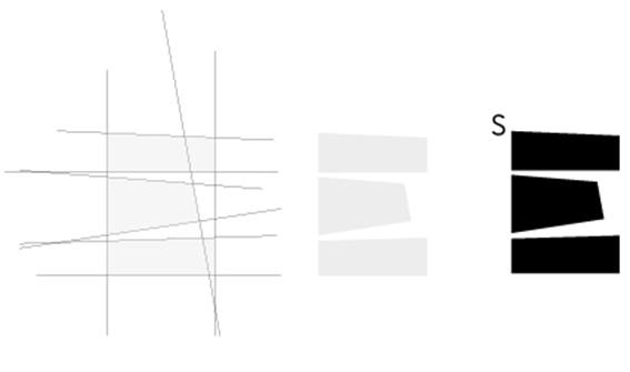
The very layout of the streets serves as a reference point. The streets are the key that perfectly represents the historical (old Jewish) and symbolic character of the neighbourhood, dividing it into three areas defined by specific characteristics.
But the essence of the neighbourhood is not geometric, perfect, invariable. It is changing, irregular; it is what makes it an alternative neighbourhood. Hence the abstract forms that allow us to play with new concepts and adapt them to the needs that presents us a living and organic neighbourhood in itself.
 |
The Logotype
In the case of Santa Eulalia and the name of the neighbourhood we should never forget or overlook its origin and the origin of the name, for it contains a historical weight that is of vital importance. Considering current and “alternative” streams and developments, we continue to maintain the traditional, relatable and clear essence that extends a hand to all neighbours who want to continue to identify with traditions, and which have a clear sense of origin.
 |
Combination Mark
In the end, the identity expresses intergenerational coexistence, the co-existence of a diverse, plural and living society, capable of adapting and evolving to any challenge. In essence it identifies the unity of a group of people who share an urban space that is and wants to be different.
 |
The orange colour comes from the recovery of the traditional colours used in the facades of buildings, saturated to amplify its positive and unifying character. And the irregular forms extracted from his cartography make up all the elements of visual communication and also the iconography used.
 |
Conclusions
The design of the brand has been inspired by the neighbourhood itself: the structure of its streets, colours, history and stories that have given it its own personality, particularly inspired by its inhabitants, their differences and coincidences, in their diversity and in their creativity.
Santa Eulalia is a lively neighbourhood and so is the brand we have designed, projecting the values inherent to its identity: a plural, heterogeneous and creative neighbourhood with much to offer; and towards the residents it has to persuade them to go down and into the street, to encourage them to coexist in a common space to continue imagining and building a better neighbourhood for all citizens.
Authors:
Artsolut Estudio: Fernando Marín, Andrés Montalbán e Irene Tomás.
Submitted by fvirgilio on